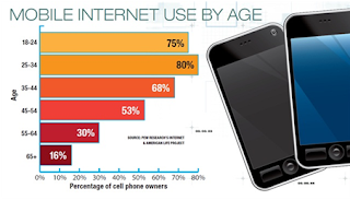
 In 2011, Hertz’s mobile traffic accounted for 4% of
its Hertz.com total traffic. In 2012, that number rose to 12% — and the company
only expects it to rise in the coming years, says Joseph Eckroth, Hertz’s chief
information officer.
As a response to the growing mobile traffic, which
includes tablet use, and in anticipation of the growth in this segment, Hertz
overhauled its website in order to offer responsive web design.
A responsive website changes its formatting
depending on where it’s being viewed — on a desktop, tablet or smart phone.
Triggers set into the HTML coding of the website dictate how the site
re-formats for friendlier views. Allowing this flexibility between screen sizes means
that no matter where a person sees the site, it’s in the most user-friendly
format for the device. This flexibility is particularly important with the
growing number of mobile users.
“We know that 24 months from now [mobile] is not
going to be an interesting phenomena but a dominant channel,” Eckroth says,
adding that Hertz’s move toward this design is focused on the customer
experience.
“We want to have every advantage as mobile grows,
and we want people to come to us first and never leave us,” he says. “The only
way to do that is by making that experience extraordinarily user-friendly, fast
and easy, and then you give them what they want on the device or the browser
they want it on, and the HTML responds in the design.”
One of the purposes of responsive web design is to
make the website the same across mobile devices, so each type of device had to
be tested as well. Also it is important having brand consistency, adding certain usability factors, such as the
ability to tap links easily on a touchscreen.
Getting real people to test the site on different devices played an important role in how these usability factors affected the layout of each screen.
Getting real people to test the site on different devices played an important role in how these usability factors affected the layout of each screen.
Another important factor for Boost is that the
company has at least some promotional material that is viewable no matter what
device is being used.
What is Responsive Web Design?
Not to be confused with an app or a mobile website, a
responsive website allows a company to use the same website coding for various
platforms: a desktop, a tablet and a smart phone. For a responsive web design,
the coding involves certain triggers that, as a screen gets smaller, make it
easier to navigate.
Responsive web design allows a company to more easily manage how its website looks across these platforms. And more importantly, if a change is made to the website, a web developer only has to make that change once, instead of changing the coding for every platform. In essence, a responsive web design formats itself based on the size of the screen you’re viewing it on. As the screen gets smaller, the website is stripped down to what’s most important for the user.
Should You Have A
Responsive Website?
While this type of web design has been picking up headlines
recently, it has been around for several years.
Companies should be rolling this design out to their site since mobile web use is only going to increase. If your website is seeing mobile traffic — including from tablets — hitting anywhere near 20%, then responsive web design should be a priority.
How does it work?
As seen in the Boost website, there
are multiple trigger points where the site reassembles as you change the size
of the screen. This response to the screen width organizes the information so
it’s easier to view at that screen size.
A website can be tested on a regular desktop for responsive web
design by manually decreasing/increasing the window using the arrows that
appear when you hover over the sides of a window. .... also the sizes of the different platform's screen.
Expectations on Boost
For Boost the most important part of
the website that needs to remain regardless of screen size is the visualization in an organized and attractive way for the user to navigate.
A responsive web design will see a return on investment on the long term since your web staff — or your third-party web management company — will need to spend less time working on the website every time there is a change.
A responsive web design will see a return on investment on the long term since your web staff — or your third-party web management company — will need to spend less time working on the website every time there is a change.
As well, the usability just may encourage more people
to go through your company's website when they’re on the go.
So are you ready to be Mobile Ready?
Call us +1 800 524 2320or Contact us online.
Boost Web & Seo
4645 East Anaheim St.
Long Beach CA 90804


0 comments:
Post a Comment